Brand & Web · 3 live sites
Coca-Cola Consolidated Web Properties
One parent brand, three websites, and almost no overlap in who visits them. The corporate site answers to investors, job seekers, and press. Red Classic has to win shippers, carriers, and drivers. ERS sells equipment service to businesses. Each one needed a structure built for the people actually using it.
- Role
- UI/UX Designer (corporate site)
Lead UI/UX Designer (Red Classic, ERS) - Org
- Coca-Cola Consolidated and two subsidiaries
- Scope
- Information architecture, visual design, web development
- Live Sites
- cokeconsolidated.com
redclassic.com
erscompany.com


The Common Thread
Each site had the same underlying problem: several audiences served through one undifferentiated structure that was not built with any of them in mind. And each company had a real operation behind it that the old site undersold.
The approach carried across all three. Audit the content against what each audience actually needs, restructure the information architecture so people reach what they came for directly, and let the real operation (its scale, its services, its people) carry the credibility instead of generic marketing copy.
| Site | Who it serves | Key structural decision |
|---|---|---|
| cokeconsolidated.com | Investors, job seekers, community partners, press | Rebuilt the IA around each audience, and embedded the vendor-managed Investor Relations section inside the main site's shell |
| redclassic.com | Shippers, carrier partners, drivers and technicians | Gave Transportation and Fleet Maintenance equal weight, with recruiting kept apart from the commercial pitch |
| erscompany.com | Prospective business clients, existing customers | Gave each of seven service lines its own page, all built on one repeatable layout |
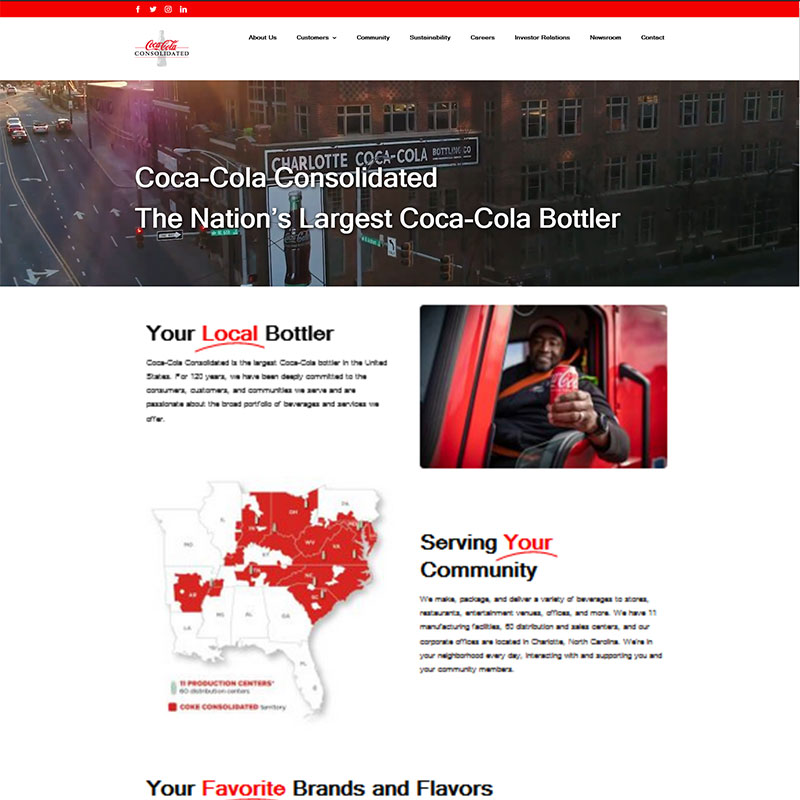
cokeconsolidated.com
Corporate Website Redesign
The challenge. The previous corporate site had fallen behind the scale of the company it represented: visually dated, inconsistent in tone across pages, and serving investors, prospective employees, community partners, and press through a single structure that was not built with any of them specifically in mind.
One constraint shaped a significant part of the work. Investor Relations is built and maintained by a third-party vendor for security and compliance reasons, and could not be rebuilt as part of the redesign. The question was how to make a section the team didn't control feel like part of one coherent site rather than a visibly bolted-on system.
The approach. I led the end-to-end redesign in close collaboration with the Corporate Communications team, starting with an audit of the existing content architecture against the needs of each audience. The information architecture was rebuilt to give each audience a more direct path, and the visual system was rebuilt on Coca-Cola Consolidated's brand standards with stronger typographic hierarchy and more disciplined use of color and photography. Accessibility and responsive performance were requirements throughout, since the site is often a visitor's first interaction with the brand.
For Investor Relations, the integration became an iframe: the vendor's site loads inside the main site's shell, so primary navigation and brand chrome stay consistent even though the embedded content runs on a different system with its own older styling. It is a visible seam rather than a hidden one, the tradeoff of meeting a real security constraint without sending investors to a jarring, fully separate experience.
The outcome. One consistent visual system across Home, About Us, Sustainability, and Media, with the compliance-sensitive Investor Relations section kept secure behind a unified navigation shell, without taking on the cost or risk of rebuilding a system the team didn't own.
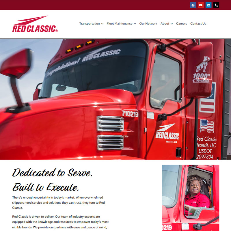
redclassic.com
Red Classic Transportation & Fleet Maintenance
The challenge. Red Classic runs an unusual combination for a carrier: comprehensive transportation alongside full fleet maintenance, operating out of multiple hubs and 30-plus terminals across 13 states. The existing site didn't reflect that scale or that dual capability, and it had to speak to three audiences at once: shippers evaluating a logistics partner, carrier partners considering a freight relationship, and drivers or technicians exploring a job.
The approach. I led the design and development, organizing the site around the two core service lines, Transportation and Fleet Maintenance, instead of burying maintenance under transportation as the old site had. Each audience got its own path: a shipper can reach a quote request without wading through recruiting content, and a prospective driver can find openings without digging through maintenance service pages.
The visual design drew on Red Classic's "Dedicated to Serve. Built to Execute." identity, using photography of the actual fleet and maintenance operations rather than stock imagery, since the real operation was the most credible thing the site had to show.
The outcome. Both halves of the business now have one coherent home. Shippers and carrier partners can see the operation's real scale instead of generic service copy, and recruiting content for drivers and technicians sits apart from the commercial pitch instead of being mixed into it.
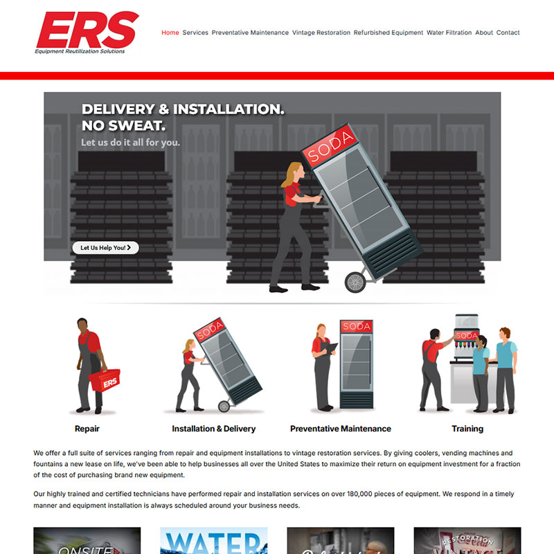
erscompany.com
ERS Company Website
The challenge. Equipment Reutilization Solutions (ERS), based in Monroe, NC, repairs, installs, maintains, and restores commercial beverage equipment (coolers, vending machines, fountains, and more) for businesses across the United States. Its certified technicians have serviced over 180,000 pieces of equipment, but the old site didn't communicate the breadth of that work, from standard repair and preventative maintenance to a 9-Step Certified Refurbishment process and vintage restoration. It needed to serve both prospective business clients and existing customers who wanted to understand quickly what ERS could do for them.
The approach. I led the design and development with a focus on service discoverability. Each of ERS's seven service lines (Repair, Installation & Delivery, Preventative Maintenance, Training, Vintage Restoration, Refurbished Equipment, and Water Filtration) got its own dedicated page, all built on one consistent layout: what the service is, what it covers, and how to request it. A visitor sees the same scannable structure whether they land on Repair or Vintage Restoration.
The outcome. A prospective client looking for one specific service can land directly on it instead of parsing it out of a broader paragraph, and the 180,000-plus figure that anchors the real operation is stated plainly instead of buried in marketing language.
What Carried Across
Three different businesses, one discipline: work out who each site is really for, give each of those people a direct path, and let the real operation make the case. All three sites are live and in production.
Currently looking
Open to senior product design roles
If this is the kind of problem your team is working on, I would like to hear about it. I am based in Charlotte, NC and open to remote.
Message me on LinkedIn (opens in a new tab) See the other case studies