© 2026 Jonathan Wadsworth
Connect on LinkedIn
Lead Product & UX Designer
I turn complex systems into clear, scalable experiences. For 14 years I have been the designer organizations rely on when the product is large, the stakes are real, and the work has to hold up.

I make complex things work simply.
-
Experience: 14+ Years
-
Specialty: UX, UI, Design Systems
-
Location: Charlotte, NC
-
Email: JonathanWadsworthDesign@gmail.com
-
LinkedIn: View Profile
-
Resume: Download PDF
-
Freelance: Available
Most designers can make something look good. Fewer can make it scale. I sit at the intersection of both: a designer who thinks in systems, works fluently with engineers, and has spent 14 years building digital products that perform at enterprise scale across thousands of users, dozens of stakeholders, and product lines that cannot afford to fail.
I have led design for the largest Coca-Cola bottler in the United States, built systems that brought order to organizations that had none, and shipped work that is still running in production today. What I bring to a team is not just craft. It is clarity, direction, and the discipline to see it through.

What I Bring
-
01 UX Strategy & Direction
Design without strategy is decoration. I get to the root of what a product needs to accomplish, then create the framework that lets every decision after it move faster and land better.
UX Strategy & Direction
The most expensive design problems are the ones that get discovered late. I work upstream: with stakeholders, product managers, and engineers to align on what we are building and why, before a single pixel is placed.
That means user research, information architecture, experience principles, and the kind of documented design rationale that keeps teams from relitigating the same decisions six months later. My strategic work tends to outlast the projects it starts on, because it gives organizations something they can actually build from.
If your team is moving fast but keeps ending up in the wrong place, this is where we start.
-
02 Product Design
I own the full arc from zero to shipped. Discovery, wireframes, prototypes, high-fidelity UI, and the cross-functional coordination that gets it across the finish line without losing what made it good.
Product Design
Product design is not a phase. It is a practice that runs through every stage of a product's life. I have done this work in enterprise SaaS environments where a confusing interface costs real money, and in consumer products where first impressions are everything.
What distinguishes my approach is the ability to hold the whole picture: user needs, business constraints, technical reality, and long-term scalability, all at once. I do not hand off a beautiful design and disappear. I stay in it with the team until the product shipped matches the product designed.
The result is work that is not just polished, but coherent, defensible, and built to evolve.
-
03 Design Systems
A design system built right is the closest thing to cloning your best designer. I build systems that teams actually use: documented, governed, and structured to scale without falling apart.
Design Systems
Most design systems fail not because they were designed badly, but because they were not designed to be adopted. I build systems with that reality in mind: clear documentation, practical governance, and the buy-in process that gets engineers and designers actually using them.
I have built component libraries and token structures for organizations operating across multiple product lines and sub-brands, where consistency is not just a design preference but an operational requirement. The systems I build are structured enough to prevent drift and flexible enough to not become a bottleneck.
If your organization is scaling and your design is starting to fracture, this is how you fix it before it becomes expensive.
-
04 Brand & Visual Design
A brand that cannot be applied consistently is not a brand yet. I design identities built for real-world use: sharp enough to make an impression, structured enough to survive a 50-person team.
Brand & Visual Design
Brand identity is where design gets seen first and judged fastest. I approach it as a system problem as much as a craft problem: the logo matters, but what matters more is whether the brand holds together when 40 people across 3 departments are applying it independently.
I have led visual identity and brand refresh work for large organizations managing multiple sub-brands under a single parent, where the stakes of inconsistency are measured in trust and revenue. The deliverable is not just a style guide. It is a framework people can actually work from.
The best brand work I have done is work you would not recognize as a redesign. It just looks like the organization finally got clear about who they are.
-
05 Front-End Development
I speak both languages. Designers who can build reduce friction, catch problems early, and earn trust with engineering teams that most designers never get. That fluency changes how a team works.
Front-End Development
There is a particular kind of trust that engineers extend to designers who can open a codebase and find their way around. I have earned that trust repeatedly, and it changes the dynamic of every product team I have been part of.
I write semantic, accessible HTML and CSS. I prototype in the browser when a static mockup is not enough to communicate intent. I flag implementation risks before they reach sprint planning. And when something gets built differently than it was designed, I can have a specific, technical conversation about why it matters and what to do about it.
That is the difference between a designer who hands off and a designer who ships.
-
06 Accessibility
Accessibility is not a compliance exercise. It is a signal about how seriously a team takes quality. I build it in from the start, which means it costs a fraction of what it costs to retrofit later.
Accessibility
Organizations that treat accessibility as a legal obligation rather than a design standard tend to end up with products that are technically compliant and practically unusable. I have seen both sides of that, and I know which one leads to better products and fewer remediation bills.
I integrate WCAG 2.1 AA requirements into the design process from day one: in component libraries, in design systems, in review checklists, and in the conversations with developers that happen before code is written. When accessibility is designed in, it stays in.
Accessible products are also better products. Cleaner hierarchy. Clearer language. More resilient layouts. Every team I have introduced this practice to has seen the difference in the work itself, not just the audit results.
Where I've Done This Work
Case Studies
-
Case Study
Authorization Tracker 2.0
Role: Lead UI/UX Designer | Client: Coca-Cola Consolidated | Platform: CONA Enterprise Web Application
Want to try it yourself? A live, interactive preview of Authorization Tracker 2.0 is available to click through.Open Live Preview →The Challenge
Before Authorization Tracker 2.0, roughly 200 users across about 10 manager-led teams tracked retail product authorizations in a single shared Excel workbook. Every CDM and field marketer was reading from and writing to the same file: status updates collided, version history was unreliable, and there was no way to tell who had acted on an initiative or when. As the organization's retail strategy grew to cover Innovation programs, Retail Promotions, and Sustaining Look of Success requirements across thousands of store locations, the spreadsheet model could not scale. There was no role-based access, no delegation, and no real-time visibility into where an authorization stood in the approval chain.The 2.0 rebuild was not just a visual refresh. It needed to replace a manual, error-prone process with a governed system of record that teams would actually trust enough to abandon the spreadsheet entirely.
The Approach
I partnered with a business analyst to define requirements: which pages were needed, what information each role needed to see, and how the workflow tracks should be separated. From there I owned the UX and UI design end to end, building the wireframes, page flows, and brand-aligned UI for the full application. The 2.0 architecture introduced three distinct workflow tracks, Innovation, Retail Promotions, and Sustaining LOS, each with its own data model and authorization logic, accessible through a single unified interface.A central design challenge was the Customer Collection system: a way for teams to define, save, and reuse custom store groupings across multiple initiatives and promotions. This required careful information architecture work to make the creation, editing, and association flows intuitive without adding friction to the daily authorization workflow. The new Local Data Management tools gave bottler administrators direct control over execution detail categories, zone definitions, and super channel configurations. User management was rebuilt with a delegated permissions model, allowing administrators to manage CDM and marketing role access at a granular level. The monthly tracker view was expanded to give teams a full fiscal-year picture of authorization status, store participation counts, and execution percentages in a single scannable interface.
The Outcome
Once Authorization Tracker 2.0 launched, the shared Excel workbook was retired. All roughly 200 users across the 10 manager-led teams moved onto the new platform, which gave each role its own permissioned view instead of one shared file everyone was editing at once. Approval and authorization workflows that used to depend on manually updating and reconciling a spreadsheet moved noticeably faster, since status changes, store groupings, and execution data were now tracked in one governed system instead of being re-keyed across versions. The result was a more scalable, more accountable authorization workflow built to support a distribution network operating at a scale very few organizations ever reach.Selected Screens
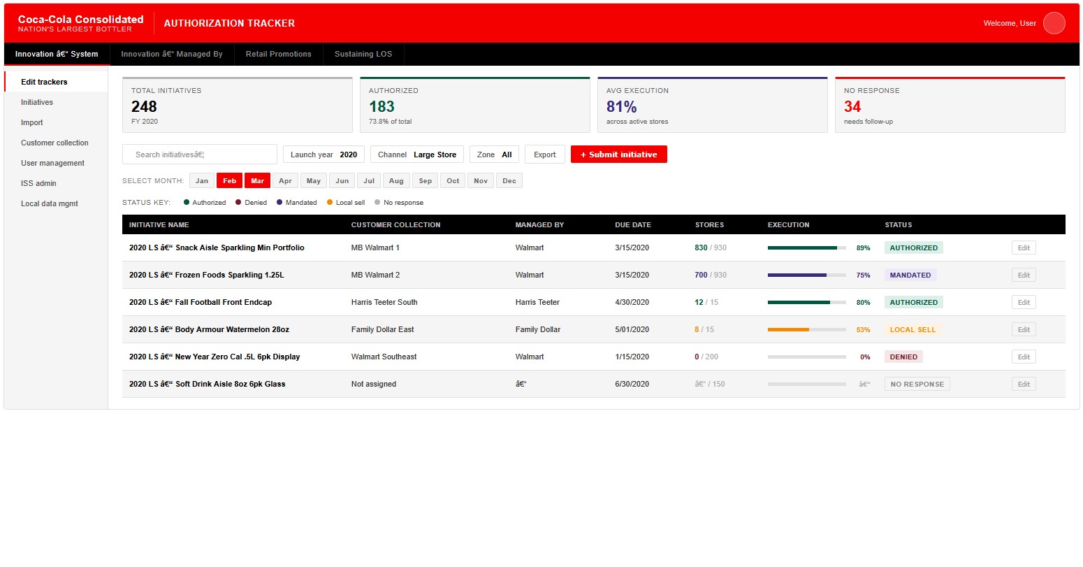
Wireframes from the production application, covering the three workflow tracks plus the two systems described above.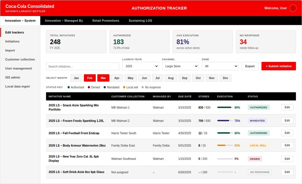 Innovation System tracker One of three workflow tracks, with sidebar navigation to Customer Collection, User Management, and Local Data Management.
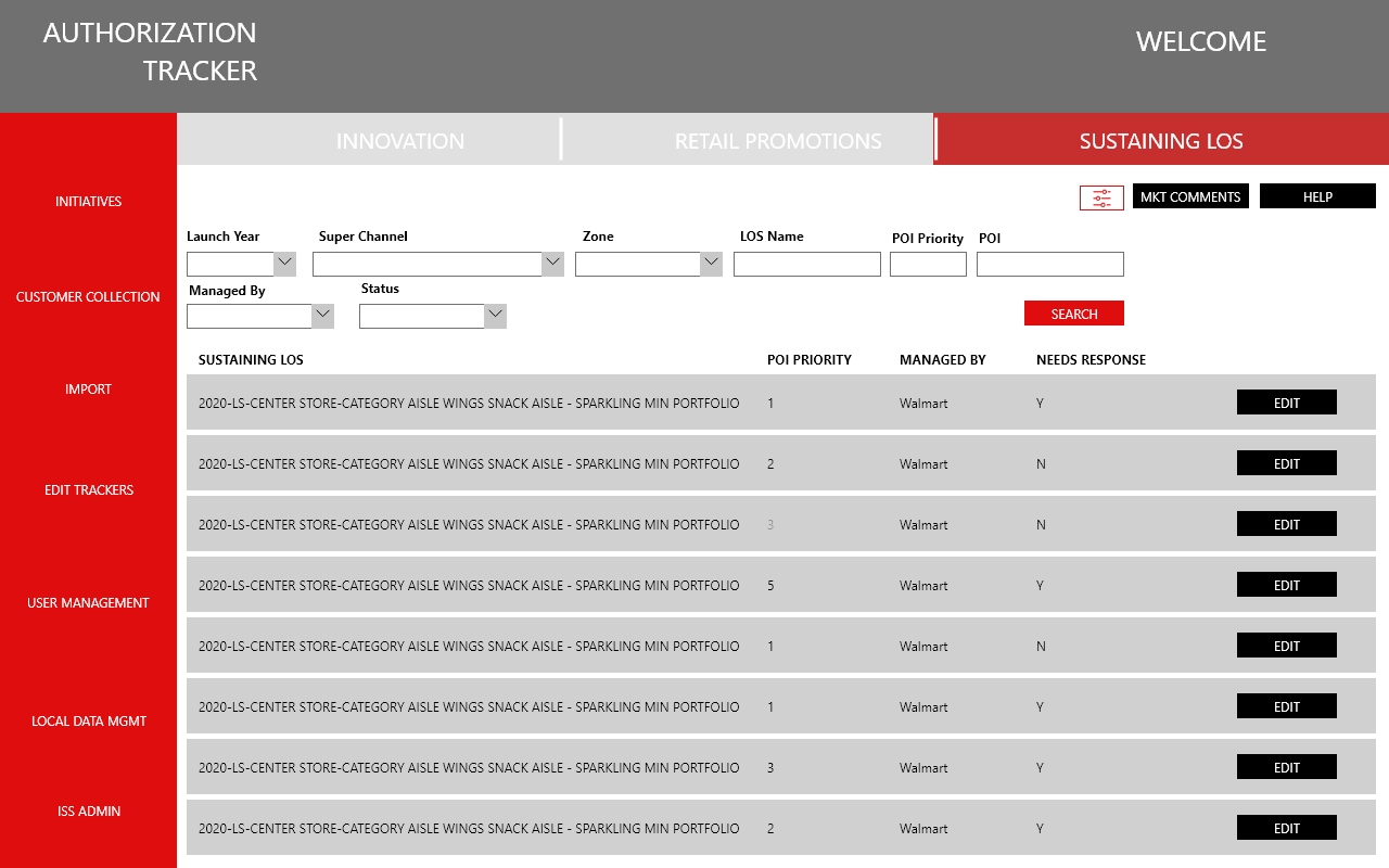 Sustaining LOS tracking POI priority and needs-response flags give field teams a fast way to see what still needs action.
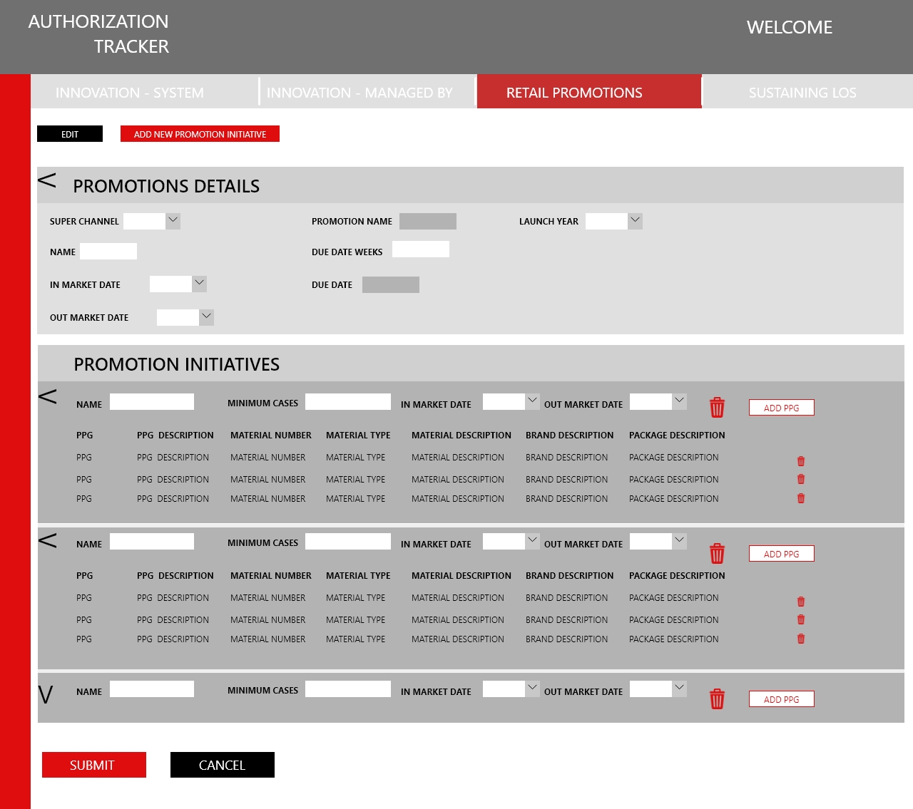 Retail Promotions: initiative builder PPG-level material detail nested under each promotion initiative, the densest form in the application.
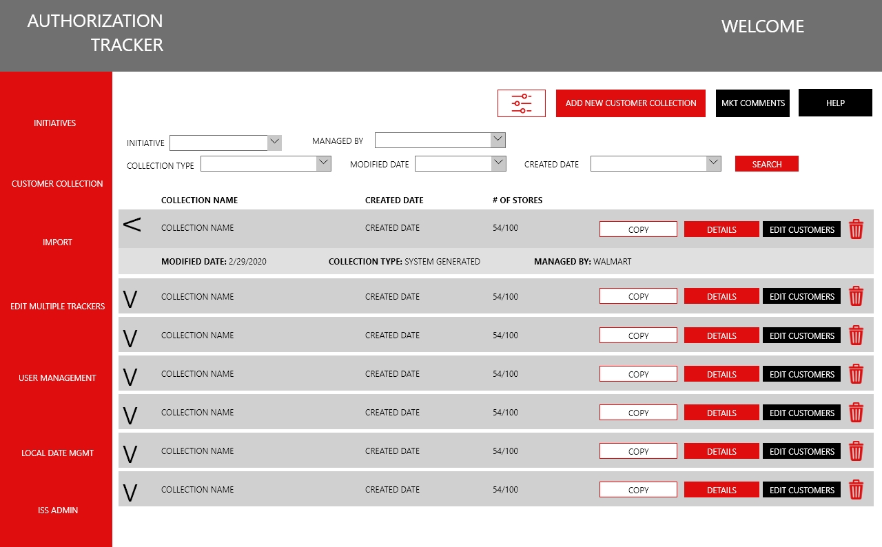 Customer Collection Reusable store groupings teams could save and apply across multiple initiatives, the central design challenge of the rebuild.
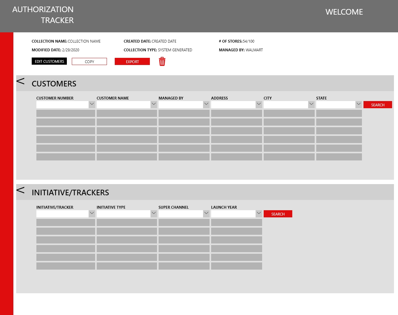 Customer Collection: detail view Cross-references the customers in a collection against every initiative or tracker using it.
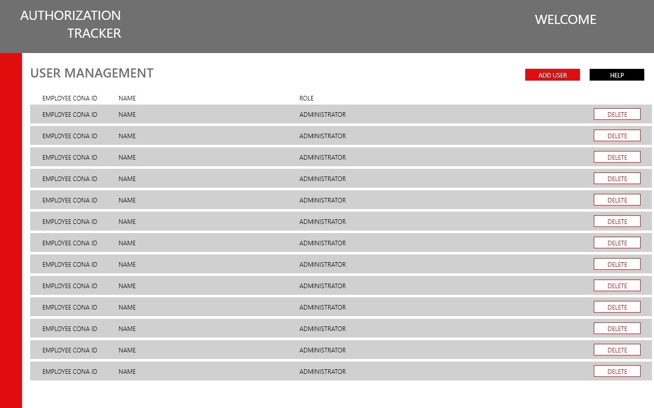 User Management The delegated permissions model: administrators manage role access at a granular level instead of a flat, shared file.
 -
Case Study
Club Coke
Role: UX Designer | Client: Coca-Cola Consolidated | Platform: Enterprise iPad Application on SAP HANA | Scope: Approval Workflow & Legal/Contract Execution
Want to try it yourself? A live, interactive preview of Club Coke is available to click through.Open Live Preview →The Challenge
Club Coke is a fully deployed enterprise iPad application used by Coca-Cola Consolidated field representatives to manage the entire commercial planning and contract lifecycle for retail accounts across the bottling network. The platform covers account discovery, commercial plan building, Look of Success presentations, pricing, funding, and legal execution in a single end-to-end workflow. I was brought in to design two of the most governance-critical sections of the application: the multi-tier approval workflow and the legal contract execution suite.The approval workflow sits at the intersection of business rules, financial guardrails, and organizational hierarchy. A field rep's commercial plan for any given account must pass through a tiered chain of approvers, from ASMs to Directors to Senior Directors to Vice Presidents, with specific guardrails automatically determining which level of approval is required based on the plan's financial parameters. Contract Break Even %, Lifetime Funding per Case, Pricing Level Versus Categories, and Volume per Asset are just a few of the guardrail conditions that route plans to the right approver. Getting any of this wrong in the field means a contract that cannot be executed, a deal that stalls, or a compliance failure that has real financial consequences.
The Approach
For the approval workflow, the core design challenge was making a highly complex, rule-driven routing system legible to field reps who needed to understand where their plan stood, why it was routed the way it was, and what needed to change to move it forward. I designed the Required Approver Levels modal, which surfaces the full guardrail matrix in a scannable table format showing each guardrail condition, its required final approver, and the resulting approval level. Color-coded rows flag which specific guardrails are triggering elevated approval requirements, giving reps immediate, actionable clarity without requiring them to understand the underlying business logic from scratch.The SNAPSHOT panel, persistent throughout the plan-building workflow, was designed to give reps a live, at-a-glance view of how their current plan compares to the existing account state across every key metric: volume, funding, assets, gross profit, operating profit, and lifetime value. This persistent context panel was critical to the approval workflow because it let reps understand in real time whether a plan change would trigger a guardrail, before they submitted for approval.
For the legal and contract execution suite, I designed the full Terms and Conditions presentation, the dual-signature capture interface for both the customer and the CCBCC employee, the ACH and W9 forms section, and the EMO (Equipment Management Order) linking workflow. The signature screens had to work reliably on an iPad in a retail environment, display the full contract terms legibly, and capture legally valid signatures from both parties in a flow that a field rep could complete at the customer's location without technical support. The Contract Details modal, which captures start date, term length, and auto-calculates the end date, was designed to be fast and error-resistant, since a misconfigured contract term has downstream legal and financial implications that cannot easily be corrected after the fact.
The Outcome
Club Coke shipped and was deployed to Coca-Cola Consolidated field representatives managing several hundred retail accounts across the bottling network. The approval workflow and legal execution features I designed handle real commercial contracts, real funding commitments, and real multi-party signatures on active accounts. Every interface decision had to account for the fact that field reps use this tool in a retail environment, often under time pressure, with a customer in front of them and a contract on the line.Selected Screens
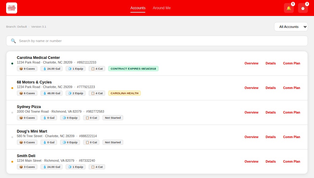
Screens from the production application, covering account discovery, the approval and funding snapshot, and the full legal contract execution suite.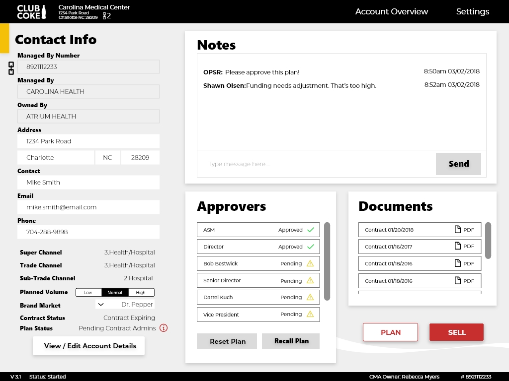 Account Overview Tiered approver chain, plan status, and account contact info in a single view for the field rep.
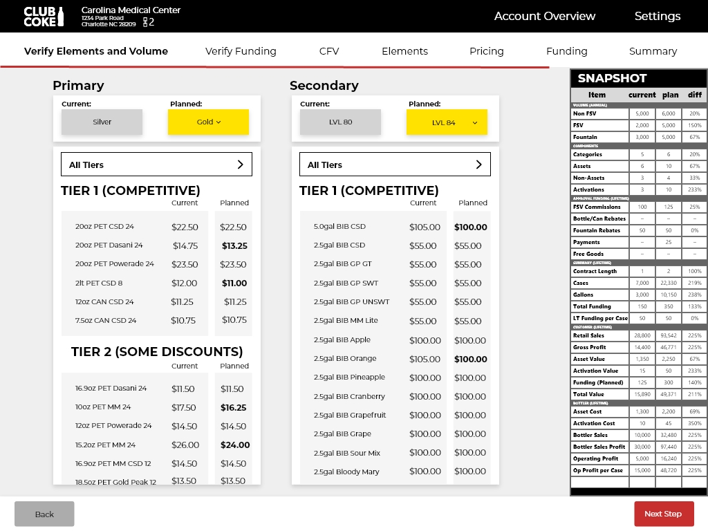 Pricing with SNAPSHOT panel The persistent SNAPSHOT panel, giving reps a live current-versus-planned view across every key metric as they build a plan.
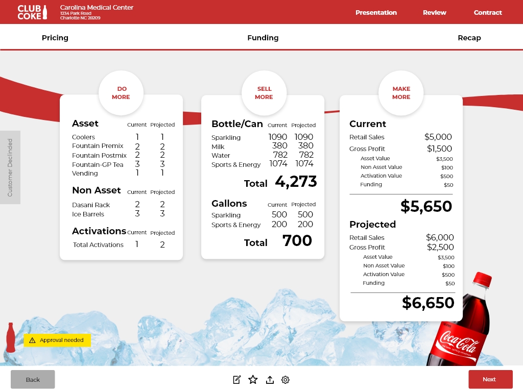 Contract Recap Current versus projected financials with an approval-needed flag when a plan crosses a guardrail.
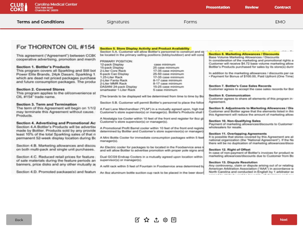 Terms and Conditions The full legal contract presentation, designed to stay legible on an iPad in a retail environment.
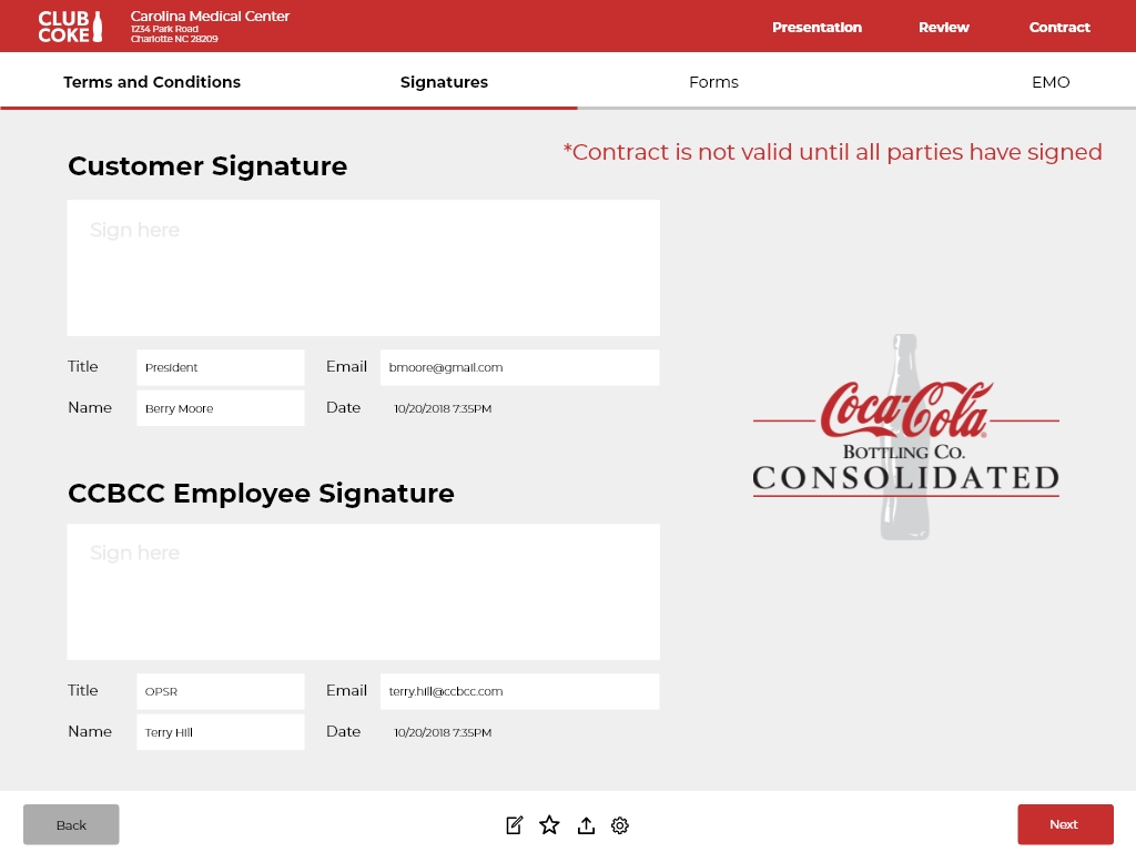 Signature Capture Dual-signature flow for both the customer and the CCBCC employee, built to capture legally valid signatures in the field.
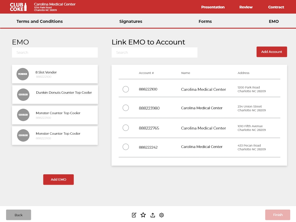 EMO Linking The Equipment Management Order workflow, linking vending and cooler assets to an account.
 -
Case Study
Coca-Cola Consolidated Design Council
Role: Founder & Chair | Org: Coca-Cola Consolidated | Deliverable: Enterprise Design Governance Program
The Challenge
Coca-Cola Consolidated operates one of the most complex digital ecosystems in the beverage industry, with digital properties, internal platforms, and branded experiences spanning IT, Marketing, eCommerce, Corporate Communications, HR, Equipment Services, Red Classic, CONA, Data Ventures, and Corporate Services. Each function was making independent design decisions. There was no shared standard, no cross-functional visibility, and no governing body to ensure that what shipped across those touchpoints was consistent, on-brand, or strategically aligned. The cumulative effect was brand drift at enterprise scale: not dramatic, but persistent, and expensive to unwind.The Approach
I founded and chaired the Coca-Cola Consolidated Design Council, a cross-functional governance body with representation from every major business unit in the organization, meeting monthly. I authored the Design Council Charter, a formal governing document that established the council's scope, objectives, methodology, compliance strategy, and KPI framework. The charter was written for an audience of executive leadership, IT leadership, business leaders, the PMO, and enterprise architects, and structured to live as a versioned, annually reviewed organizational document.The council's four core objectives were Responsive and Adaptive Design, Design Assessment and Standardization, Strategic Business Alignment, and Design Consolidation. Each had defined expected outcomes tied to measurable KPIs: scale of design influence across the organization, growth in design-related investment, depth of embedded design process, executive-level design representation, and integration of design into innovation culture. The compliance strategy introduced Brand Impact Assessments and Brand Compliance Reviews as standing functions of the council, with metrics designed to quantify progress over time rather than rely on subjective judgment.
The Outcome
One concrete example of the drift the council was built to catch: designers and teams across departments were each using a slightly different shade of Coca-Cola red, the single most identity-defining color the brand has. A Brand Compliance Review surfaced this and led to a standardized red being adopted across the teams represented on the council. It's a small example on its own, but it's the kind of inconsistency that compounds silently across a large organization, and exactly what the council's review process was designed to catch before it spread further.More broadly, the Design Council gave Coca-Cola Consolidated a recurring forum, meeting monthly for the better part of a year, where stakeholders across 5+ business units reviewed work against a shared, documented standard instead of relying on individual judgment calls. The charter itself remains a versioned, organizational document built to outlast any single contributor's tenure on the council.
-
Case Study
Coca-Cola Consolidated Corporate Website Redesign
Role: Lead UI/UX Designer | Timeline: 3-6 Months | Stakeholders: Corporate Communications Team | Live Site: cokeconsolidated.com
Want to see it live? This is a real, currently-live corporate website, not a recreated prototype.Visit Live Site →The Challenge
Coca-Cola Consolidated's previous corporate website had fallen behind the scale of the company it represented: visually dated, inconsistent in tone across pages, and serving a mix of audiences (investors, prospective employees, community partners, and press) through a single undifferentiated structure that wasn't built with any of them specifically in mind.One specific constraint shaped a significant part of the work: Investor Relations is built and maintained by a third-party vendor for security and compliance reasons, and could not be rebuilt as part of the redesign. The challenge was making a section the team didn't control feel like part of one coherent site rather than a visibly bolted-on system the moment a visitor clicked through to it.
The Approach
I led the end-to-end redesign of the main site in close collaboration with the Corporate Communications team, starting with an audit of the existing content architecture against the actual needs of each audience the site serves. The information architecture was rebuilt to give each audience type a more direct path to what they needed, and the visual system was rebuilt on Coca-Cola Consolidated's brand standards with stronger typographic hierarchy and more disciplined use of color and photography than the previous site had.For Investor Relations specifically, the vendor's restrictions ruled out a visual rebuild, so the integration decision became an iframe: the third-party IR site loads inside the main site's shell, keeping primary navigation and brand chrome consistent even though the embedded content itself runs on a different system with its own older styling. It's a visible seam rather than a hidden one, the tradeoff of meeting a real security constraint without giving investors a jarring, fully separate experience.
Accessibility and responsive performance were requirements throughout the rebuilt sections, since the site is often a visitor's first interaction with the brand, across a wide range of devices.
The Outcome
The redesigned site gave Coca-Cola Consolidated a consistent, modern visual system across its main public-facing pages, Home, About Us, Sustainability, and Media, while preserving a secure, vendor-managed Investor Relations section behind a unified navigation shell. The iframe approach let the team ship a cohesive brand experience for the sections it could control without taking on the cost or risk of rebuilding a compliance-sensitive system it didn't. -
Case Study
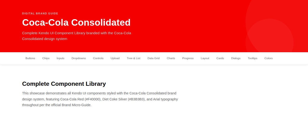
Coca-Cola Consolidated Digital Brand Guide
Role: Lead UI/UX Designer | Client: Coca-Cola Consolidated | Deliverable: Internal Brand Governance Document
Want to try it yourself? A live, interactive preview of the Digital Brand Guide component library is available to click through.Open Live Preview →The Challenge
Coca-Cola Consolidated is the largest Coca-Cola bottler in the United States, operating digital properties at significant scale. But despite that scale, no formal brand guide existed to govern how those digital experiences were designed and built. Teams across communications, IT, marketing, and engineering were making independent visual decisions, resulting in inconsistent color application, typography drift, and brand treatments that varied across properties in ways that quietly undermined the organization's credibility and cohesion.The Coca-Cola Company maintains comprehensive brand standards at the parent level, but those standards were not being formally translated into actionable guidance for the internal teams building and maintaining digital products at the bottler level. The gap between what the brand should look like and what was actually being shipped had been growing for years, and no one had taken ownership of closing it.
The Approach
Starting with UX research into The Coca-Cola Company's official brand standards, I studied the color system, typography choices, logo usage rules, photography principles, accessibility requirements, and brand voice guidelines at the parent brand level. From that research, I synthesized a Coca-Cola Consolidated-specific brand guide that translated enterprise-level standards into practical, actionable documentation for the teams doing the daily work.The guide established the complete color palette with specific hex and RGB values for every approved color, defined TCCC Unity as the required primary typeface, documented logo usage rules including approved colorways and spatial requirements, and codified the brand voice across three dimensions: Authentic, Expert, and Trusted. A clear set of Do's and Don'ts was developed to make the guidance portable and easy to apply consistently, regardless of who was building the experience or which property they were working on.
The Outcome
The resulting guide documented brand standards across 14-plus component categories, from buttons and data grids to charts, cards, and the full brand color palette, giving Coca-Cola Consolidated a shared reference that internal teams, vendors, and agency partners could all work from. Design decisions that had previously been made by instinct or individual preference could now be checked against a documented, approved standard, reducing the kind of inconsistency across digital touchpoints that the organization's growing portfolio had been accumulating for years.Selected Screens
Screens from the live component library, covering brand colors, foundational components, and data visualization built to the documented standard.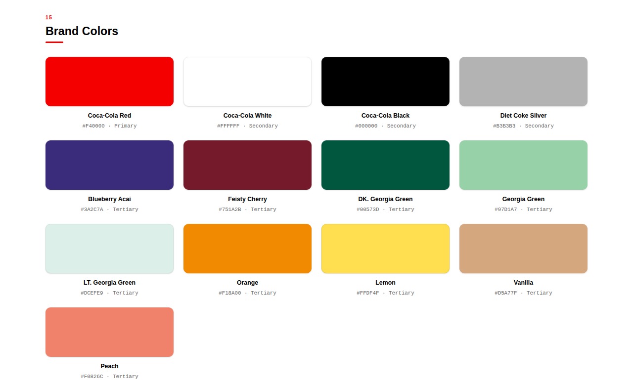 Brand Colors The complete approved palette with hex values, translating the parent brand standard into a usable reference.
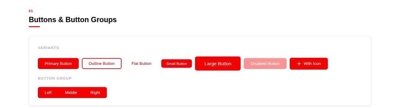 Buttons & Button Groups Foundational interactive components styled to brand, including states like disabled and grouped variants.
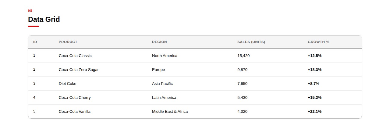 Data Grid Tabular data styled consistently with the brand's typography and color rules.
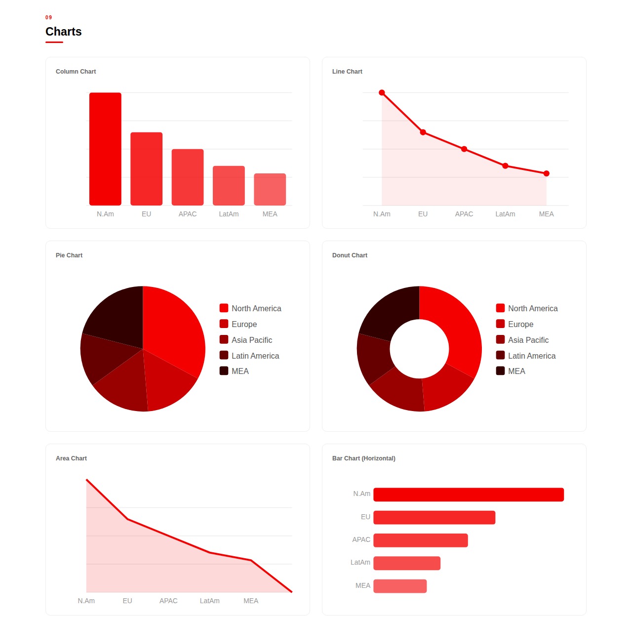 Charts Six chart types in brand-approved colorways, showing how data visualization stays on-brand across formats.
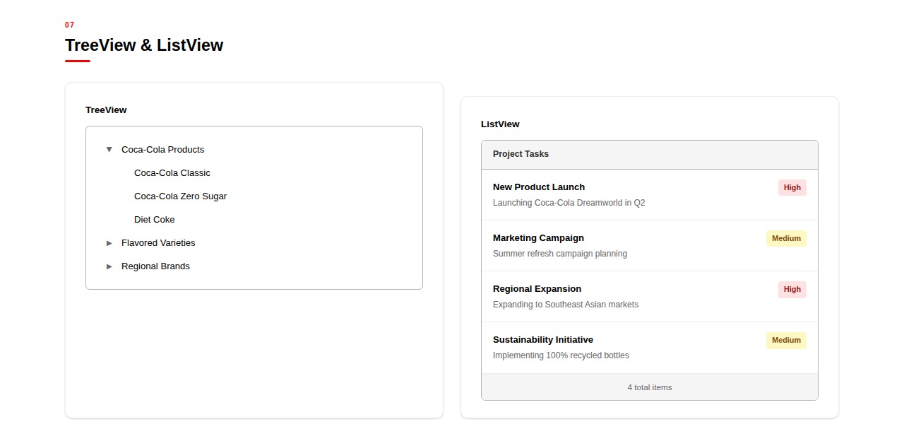 TreeView & ListView Hierarchical and list-based navigation components, styled for internal tools built on the standard.
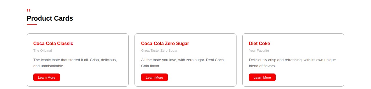 Product Cards Card components demonstrating brand voice and typography applied to consumer-facing content.
 -
Case Study
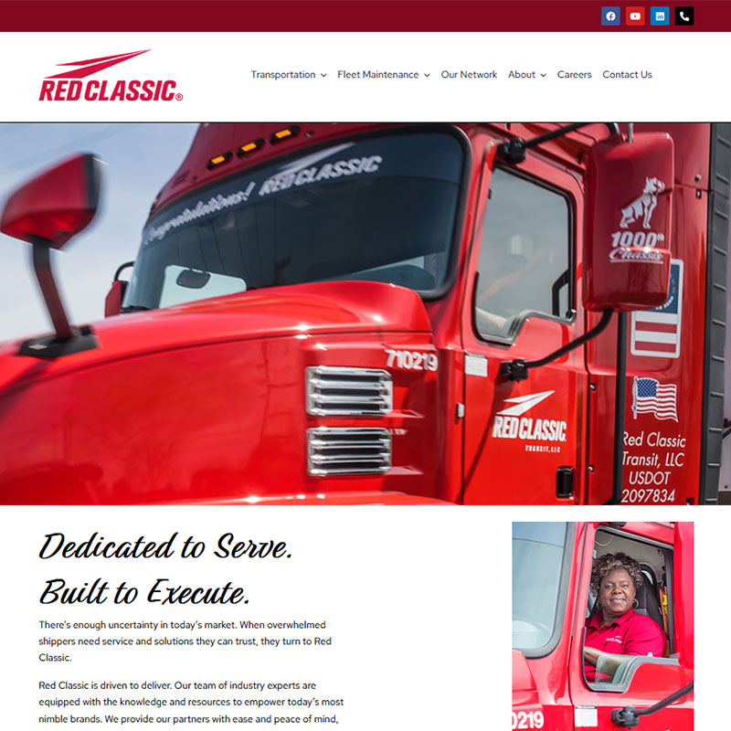
Red Classic Transportation & Fleet Maintenance Website
Role: Lead UI/UX Designer | Client: Red Classic (Coca-Cola Consolidated Subsidiary) | Live Site: redclassic.com
The Challenge
Red Classic runs a genuinely unusual combination for a carrier: comprehensive transportation alongside full fleet maintenance, backed by 80-plus maintenance shops, 325-plus technicians, and a fleet of 535-plus trucks across 13 states. The existing site didn't reflect that scale or that dual capability. As a subsidiary of Coca-Cola Consolidated, Red Classic needed a site that could stand on its own, speaking clearly to three different audiences at once: shippers evaluating a logistics partner, carrier partners considering a freight relationship, and drivers or technicians exploring a job.The Approach
I led the design and development of the Red Classic website, working with their marketing and communications stakeholders to organize the site around the two core service lines, Transportation and Fleet Maintenance, rather than burying the maintenance side under transportation as the existing site had. The information architecture was restructured so each of the three audiences had its own clear path: a shipper could get to a quote request without wading through driver recruiting content, and a prospective driver could find openings without digging through fleet maintenance service pages.The visual design pulled from Red Classic's "Dedicated to Serve. Built to Execute." identity, using high-impact photography of the actual fleet and maintenance operations rather than generic stock imagery, since the scale of the real operation was the most credible thing the site had to show.
The Outcome
The redesigned site gives Red Classic a single, coherent place to present both halves of its business, transportation and maintenance, to the three audiences who need different things from it. Shippers and carrier partners can evaluate the operation's real scale (the shop count, technician count, and fleet size) instead of generic service copy, and recruiting content for drivers and technicians sits separately from the commercial pitch instead of being mixed into it. -
Case Study
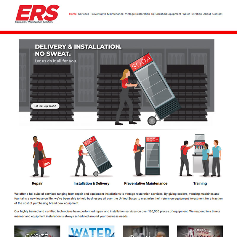
ERS Company Website
Role: Lead UI/UX Designer | Client: Equipment Reutilization Solutions (Coca-Cola Consolidated Subsidiary) | Live Site: erscompany.com
The Challenge
Equipment Reutilization Solutions (ERS) is a Monroe, NC-based service company and Coca-Cola Consolidated subsidiary specializing in the repair, installation, maintenance, and restoration of commercial beverage equipment, including coolers, vending machines, fountains, and more, for businesses across the United States. With certified technicians having serviced over 180,000 pieces of equipment, ERS had a serious operation behind them. What they needed was a website that matched it.Their existing digital presence wasn't effectively communicating the full breadth of their services, from standard repair and preventative maintenance to their 9-Step Certified Refurbishment process and vintage restoration work. The site needed to clearly serve both prospective business clients looking for a reliable service partner and existing customers who needed to quickly understand what ERS could do for them.
The Approach
I led the design and development of the ERS website with a focus on clarity and service discoverability. ERS offers a wide range of distinct service lines, including Repair, Installation & Delivery, Preventative Maintenance, Training, Vintage Restoration, Refurbished Equipment, and Water Filtration, and a major goal of the redesign was making sure each of those offerings had its own clear, findable presence on the site rather than being buried in generic copy.The visual design used clear iconography and a consistent layout pattern across every service page, so a visitor could recognize the same scannable structure (what the service is, what it covers, how to request it) whether they landed on the Repair page or the Vintage Restoration page.
The Outcome
The redesigned site gives each of ERS's seven service lines, Repair, Installation & Delivery, Preventative Maintenance, Training, Vintage Restoration, Refurbished Equipment, and Water Filtration, its own dedicated page instead of folding them into generic copy, so a prospective client searching for one specific service can land directly on it rather than parsing it out of a broader paragraph. The same 180,000-plus equipment-serviced figure that anchors ERS's real operation is now stated plainly on the site rather than buried in marketing language.

Featured Works
-
 UI/UX Authorization Tracker 2.0
Project Info
Authorization Tracker 2.0
An enterprise authorization tracking platform that replaced a single shared Excel workbook used by roughly 200 users across 10 manager-led teams. The redesigned UI gave each role a permissioned view and sped up approval and authorization workflows that had previously relied on manually updating one spreadsheet.
- Client Coca-Cola Consolidated
- Role Lead UI/UX Designer
- Category UI/UX Design
-
UI/UX Club Coke
Project Info
Club Coke
An enterprise iPad application used by Coca-Cola Consolidated field representatives to manage commercial plans and contracts for retail accounts. Scope covered the multi-tier approval workflow and the full legal contract execution suite, including signatures and equipment linking.
- Client Coca-Cola Consolidated
- Role UX Designer
- Category UI/UX Design
-
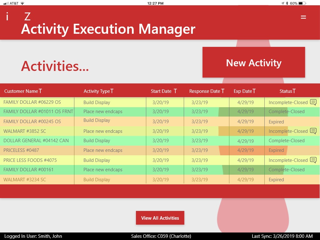
UI/UX Activity Execution Manager
Project Info
Activity Execution Manager
The Challenge
In-store merchandising and promotional execution had been tracked through a manual spreadsheet process: someone assigned a task, and there was no reliable, role-aware way to confirm who was supposed to do it, whether it had actually been completed, or who needed to sign off on it. As the volume of in-store activities grew, that process stopped scaling.The Approach
I designed Activity Execution Manager around a maker and doer model: the screens and actions a user saw were determined by their credentials, so a task creator saw assignment and approval tools while the person executing the task in the field saw only what they needed to mark a task complete. Keeping those two roles visually and functionally distinct was the core design problem, since the same platform had to serve both without either role wading through controls meant for the other.The Outcome
Activity Execution Manager replaced the manual spreadsheet process with a role-aware system where task assignment, execution, and approval each had their own clear interface, instead of everyone working from the same undifferentiated sheet.Selected Screens
Screens from both sides of the maker and doer model: the task creator's assignment view, and the field executor's matching, more restricted view of the same task.
Maker: Activities List The task creator's view, with a New Activity action and full visibility into every assigned task's status.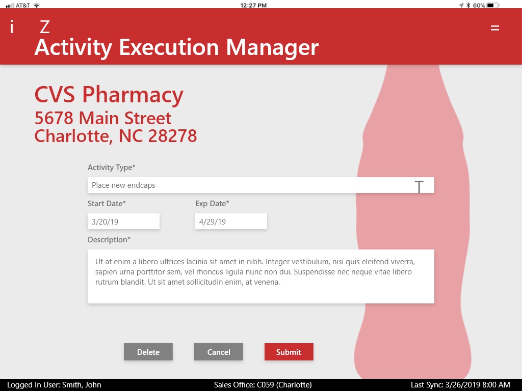 Maker: Create Activity The assignment form: account, activity type, dates, and description, available only to the maker role.
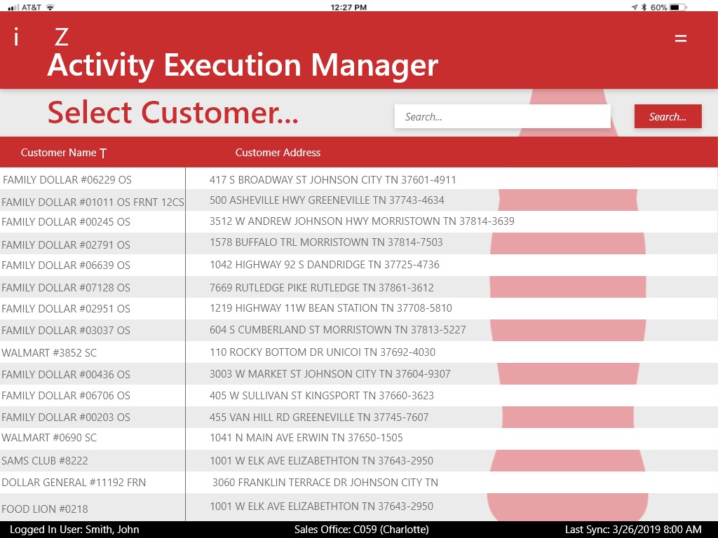 Maker: Select Customer A searchable account directory for assigning a new activity to the right retail location.
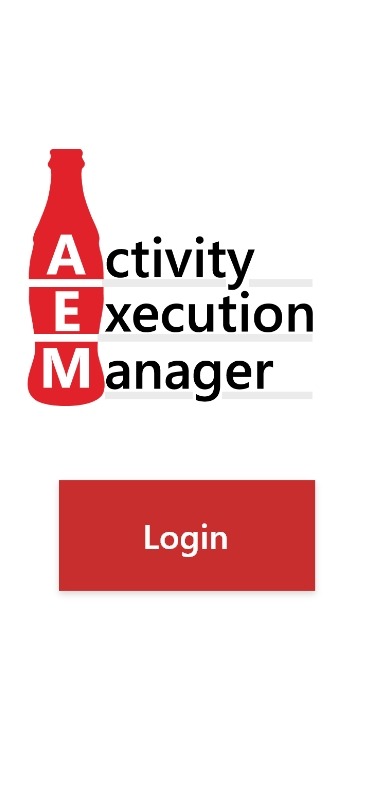 Doer: Login The field executor's entry point, on a phone rather than a tablet, reflecting how this role actually works in the field.
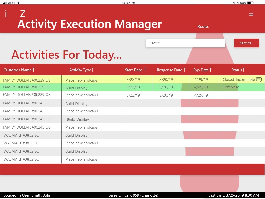 Doer: Activities For Today The same activity list concept as the maker's view, but with no creation action, since this role only executes assigned tasks.
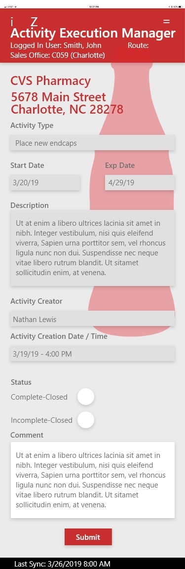 Doer: Selected Activity The clearest contrast in the app: account and task details are read-only, while completion status and a comment field are the only inputs this role has.
 App Icon & Brand Mark The AEM monogram, built into a Coca-Cola bottle silhouette, used as the app's login screen and icon.
- Client Coca-Cola Consolidated
- Role Lead UI/UX Designer
- Category UI/UX Design
-
Websites, Branding Coke To Go Website
Project Info
Coke To Go Website
The Challenge
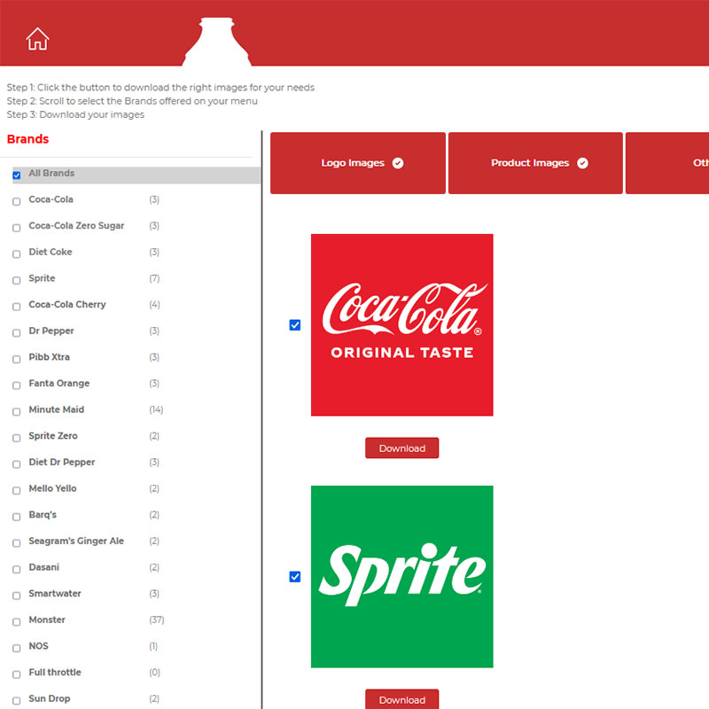
Small independent retailers, the "mom and pop" stores that carry Coca-Cola products, don't have in-house design teams or marketing budgets, but they still need menus, signage, and storefront materials that look professionally on-brand. Without an easy way to access real Coca-Cola brand assets, these businesses were left either using low-quality or outdated logos and graphics, or skipping branded materials altogether.The Approach
I designed and built Coke To Go as a self-service site where small business owners can find and download approved Coca-Cola brand assets directly, logos, product imagery, and design elements suited for menus, signage, and websites, without needing to request them through a sales rep or wait on a design team. The interface was kept simple and low-friction by design, since the audience is a business owner fitting this in between running their store, not a design professional.The Outcome
Coke To Go gives small retailers a direct, self-service path to professionally produced Coca-Cola brand assets they wouldn't otherwise have the design resources to source or recreate themselves, helping their menus and storefronts look as polished as a much larger operation's.- Client Coca-Cola Consolidated
- Role Lead UI/UX Designer
- Category Web Development, Web Design, Branding
-
Websites, Branding Coca-Cola Consolidated Corporate Website
Project Info
Coca-Cola Consolidated Corporate Website
A redesign of the corporate website for the largest Coca-Cola bottler in the United States, serving investors, prospective employees, community partners, and press. The work included rebuilding the information architecture and visual system, and integrating a vendor-managed, security-restricted Investor Relations section behind a consistent navigation shell.
- Stakeholders Corporate Communications Team
- Role Lead UI/UX Designer
- Timeline 3-6 Months
- Category Brand Refresh, Web Design, Branding
-
Websites, Branding Red Classic Website
Project Info
Red Classic Website
Web design and development for Red Classic, delivering a clean, branded digital presence that communicates the company's identity and services with clarity and impact.
- Client Red Classic
- Role Lead UI/UX Designer
- Category Web Development, Web Design, Branding
-
Websites, Branding ERS Company Website
Project Info
ERS Company Website
Web design and development for ERS, creating a cohesive and professional digital presence that reflects the company's brand identity and communicates its core offerings effectively.
- Client ERS
- Role Lead UI/UX Designer
- Category Web Development, Web Design, Branding
-
Branding Coca-Cola Consolidated IT Logo
Project Info
Coca-Cola Consolidated IT Logo
Brand identity design for the Coca-Cola Consolidated Information Technology division, creating a mark that works cohesively within the broader enterprise brand family.
- Client Coca-Cola Consolidated
- Role Lead UI/UX Designer
- Category Branding, Logo Design
-
Branding Coca-Cola Consolidated AI Hub Logo
Project Info
Coca-Cola Consolidated AI Hub Logo
Logo and brand identity design for the Coca-Cola Consolidated Artificial Intelligence Hub, establishing a forward-looking visual identity for the organization's emerging AI initiatives.
- Client Coca-Cola Consolidated
- Role Lead UI/UX Designer
- Category Branding, Logo Design
-
Branding Coca-Cola Consolidated Women's Forum Logo

Project Info
Coca-Cola Consolidated Women's Forum Logo
Brand identity for the Coca-Cola Consolidated Women's Forum, creating a mark that reflects the group's mission and values while remaining consistent with the enterprise brand family.
- Client Coca-Cola Consolidated
- Role Lead UI/UX Designer
- Category Branding, Logo Design
-
Branding Coca-Cola Consolidated RPA Logo
Project Info
Coca-Cola Consolidated RPA Logo
Logo and brand identity for the Coca-Cola Consolidated Robotic Process Automation team, giving a technical department a distinctive and credible visual identity within the broader enterprise brand system.
- Client Coca-Cola Consolidated
- Role Lead UI/UX Designer
- Category Branding, Logo Design